Logo Design & Brand Development
Imagine you’re going to a job interview, a first date, or meeting your other halves parents for the first time, what would you wear? Shorts and footy top? Of course not, why? Because first impressions matter – a lot!
Now think about what first impressions potential customers have of your business? For something that may seem so superficial on the surface actually runs deep into the psychology of buying. Whether someone’s simply buying a product in a supermarket, placing their trust in an expert for a specialist service or investing in a new employee to add to their workforce, public appearance and first impressions can make or break a business. I enjoy helping business start ups explore and discover their own identity and develop not just a logo, but a brand to be proud of. With that in mind, here’s some handy tips to consider when creating a new logo and brand.
Top Tips
- Work in black and white. Although it’s very tempting, don’t start with colour, colour is so emotive, take the emotion out of it to start with and make sure you get the fundamentals right. The high contrast of black and white will make it easier to concentrate on the form of your logo, viewing negative space and getting the balance right. Also, from a practical point of view, if anyone ever printed your logo out in black and white you can rest easy knowing that your logo will still be legible.
- THEN add colour. As I mentioned previously, colour can evoke emotion. What kind of emotion do you want to evoke in your customers? Colours can have different meanings in different cultures so it’s important you do your research to avoid any cultural faux pas. Here’s a general quick guide to colour meanings in western culture:
Red – Urgent, Strength, Passion, Love
Pink – Feminine, Romance, Youthful
Orange – Creative, Warm, Energetic, Accessible
Yellow – Youthful, Happy, Fun
Green – New, Environmental, Calming, Healing
Blue – Clean, Trustworthy, Wise, Responsible
Purple – Indulgent, Spiritual, Intuitive
Black – Elite, Fashion, Technical
White – Neutral, Clean, Simple
I could write a whole article on colour theory and which colours compliment each other best, but for now all you need to remember is my next point…
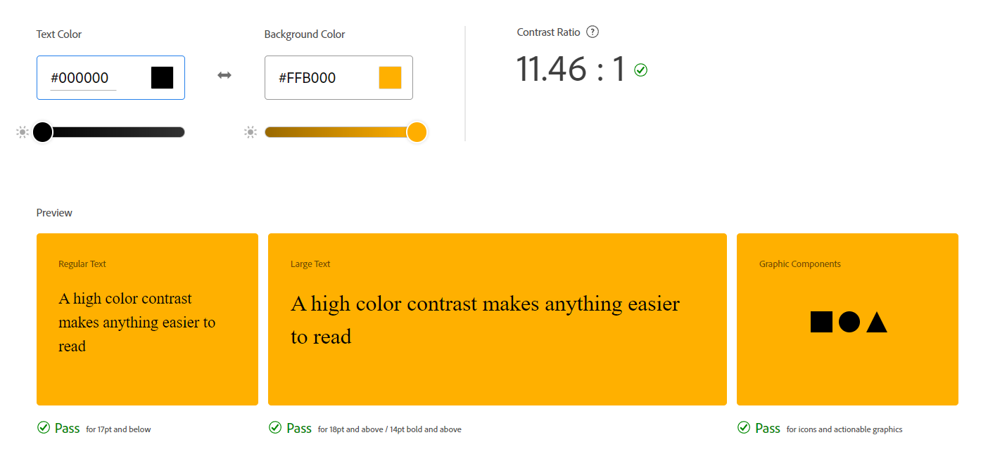
- Contrast. This point isn’t just applicable to logos but every piece of design work created for your brand. We need to keep in mind people who may have visual impairments such as colour blindness, how would your promotional material look to them? There’s a very handy online tool created by Adobe to help us with this. Visit color.adobe.com, they have an accessibility section which will tell you if your colour scheme meets the WCAG Accessibility Criteria. As a general rule you can’t go far wrong if the colour contrast ratio is 7:1 or above.

- Zoom in and out. As I’m working on a logo I always find myself zooming in and out to make sure what I’m making is still legible at various sizes. Your logo needs to be recognisable when it’s small like an app/avatar icon, or large on a billboard 100 meters away.
- Balance. The composition of a logo needs to be well balanced. This is one of those things that a member of the general public may not be able to verbally explain why something doesn’t look right, they just know it doesn’t. Using grids and guides are always helpful but don’t rely solely on these, they are just guides to help you along – always trust your eye.
- The memory test. Here’s a good way to test how memorable your logo is. Show your new logo to a group of people for 10 seconds. Hide the logo and then give them 30 seconds to sketch it from memory. If they find the task too difficult then maybe your logo is too complicated. Analyse the results and tweak your logo accordingly.
- Don’t be afraid of change, but use it wisely. If you listen to podcasts with influential, successful business people you’ll notice they’ll all have a piece of advice in common – be open to change, be adaptable. If you don’t move with the times you’ll get left behind, remember video rental company Blockbuster? So don’t be afraid to update your logo and brand identity, if your business is going through a transitional period maybe your brand should too. However! Don’t change too much too soon, you’ll risk confusing your existing customer base. As a general rule, if you find yourself getting a bit bored of your logo, it’s usually the time your existing customers are becoming accustomed to it, so only make changes if you have good enough reasons to do so.
My work
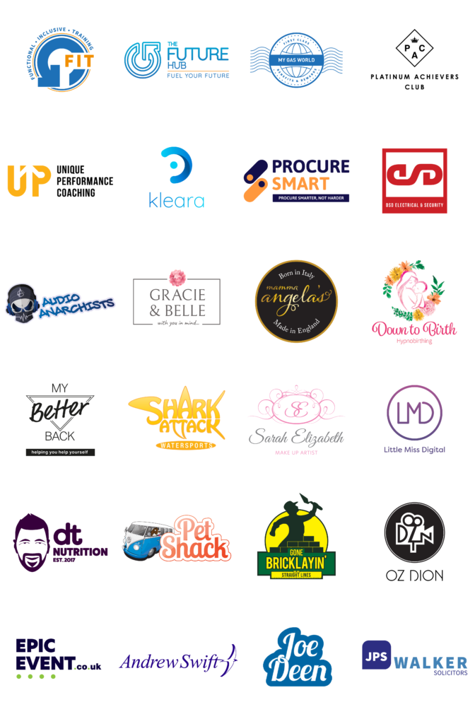
I’ve been designing logos ever since I was a child, I remember one of my first creations was for a new chocolate bar with a medieval theme called “Chocolot”, get it? A combination of Chocolate and Camelot (I’m still chuffed with my 12 year old self for that one). Since then I’ve been through college and university studying graphic design and in 2008 became a professional graphic designer, creating logos and brand guidelines for all sorts of different businesses. Here’s a collection of some the logos I’ve created over the years.

Get in touch
So, if you’re a young graphic designer learning your trade and you would like a little help with your logo designs feel free drop me an email and I’ll be happy to help. Also, if you’re a budding entrepreneur starting your own business and need the services of a graphic designer, you too can drop me an email and we’ll arrange a meeting to discuss your new venture.